Fix Font Resizing on Mobile Browsers with CSS
Posted on 18 January 2023
While making this site, I encountered a styling issue from mobile browsers on iOS (Chrome and Safari).
The font size of some elements was increased even though no CSS rules were involved.
Issue
Some mobile browsers (on iOS at least) automatically increase the font size value of certain elements to improve readability. While this may seem beneficial to the user, it can actually cause layout and design issues on websites.
Here is a screenshot of an article with automatic font size resizing issue:
You can see here that the font size of the first code snippet is much larger than the second one. However, I have defined exactly the same CSS rule for these two elements, namely font-size: 14px;.
By inspecting the elements directly on my iPhone from my Macbook (yes, it's possible and it's great, although it's only possible on Safari, here's an article that explains how to do it), we can see the effects of resizing the font size when no CSS rule is specified:
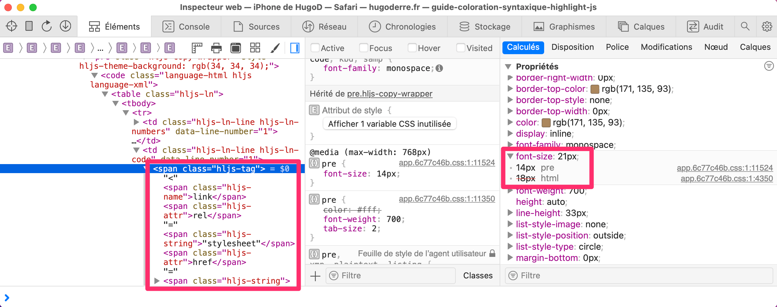
Here the browser has increased the font size of the first element to 21px! None of our CSS files are involved in this resizing, it is the browser that applies it at run time.
Disable resizing
Fortunately, there is a CSS property called text-size-adjust that fixes this problem:
-moz-text-size-adjust: none;
-webkit-text-size-adjust: none;
text-size-adjust: none;
It's important to note that this property is currently only supported by certain browsers, including Safari and Chrome on iOS devices.
0 comment